“The greatest value of a picture is when it forces us to notice what we never expected to see.” – John Tukey
Businesses that want to make the most of their data often struggle with managing large volumes of information. Even though there’s a lot of data available, many organizations find it challenging to uncover valuable insights, which means that a lot of data remains unused. This lack of actionable intelligence hampers strategic decision-making and inhibits business growth.
The key is to use effective data visualization. By converting raw data into clear, visual formats, businesses can easily spot trends and outliers and make well-informed decisions. Data visualization tools and techniques offer the clarity needed to transform complex data sets into actionable insights, ultimately improving decision-making processes and driving business success. This article explores how using data visualization can assist businesses in overcoming the challenges of data overload and tapping into the full potential of their information.
Understanding the Power of Data Visualization
Data visualization refers to the graphical representation of information and data. Using visual elements like charts, graphs, and maps, data visualization tools provide an accessible way to see and understand trends, outliers, and patterns in data. This approach makes complex data more comprehensible, allowing users to grasp intricate details quickly and effectively.
Data visualization is pivotal in business analytics because it transforms complex data sets into a visual format that is easier to interpret. For executives, clear and concise data visualizations facilitate quicker decision-making, enhance communication, and support the identification of actionable insights. This ability to present data visually is essential for driving informed strategies and achieving business objectives.
Key Data Visualization Tools for Business Leaders
With the increasing volume and complexity of data, effective analytic dashboards and data visualization tools are essential for interpreting information accurately and efficiently. These tools help make data more accessible, understandable, and usable for strategic decision-making.
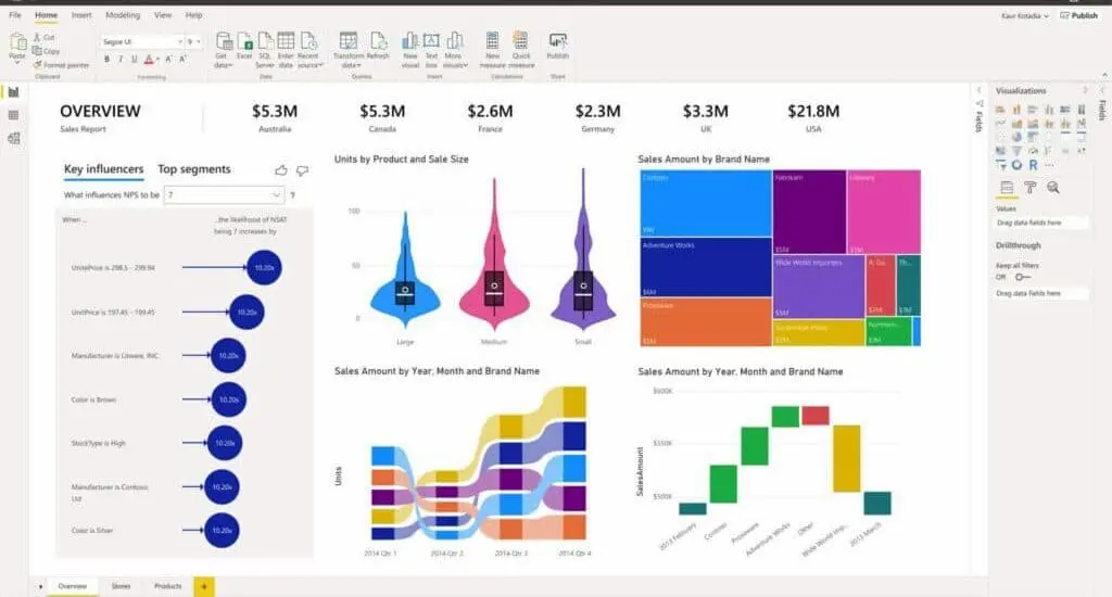
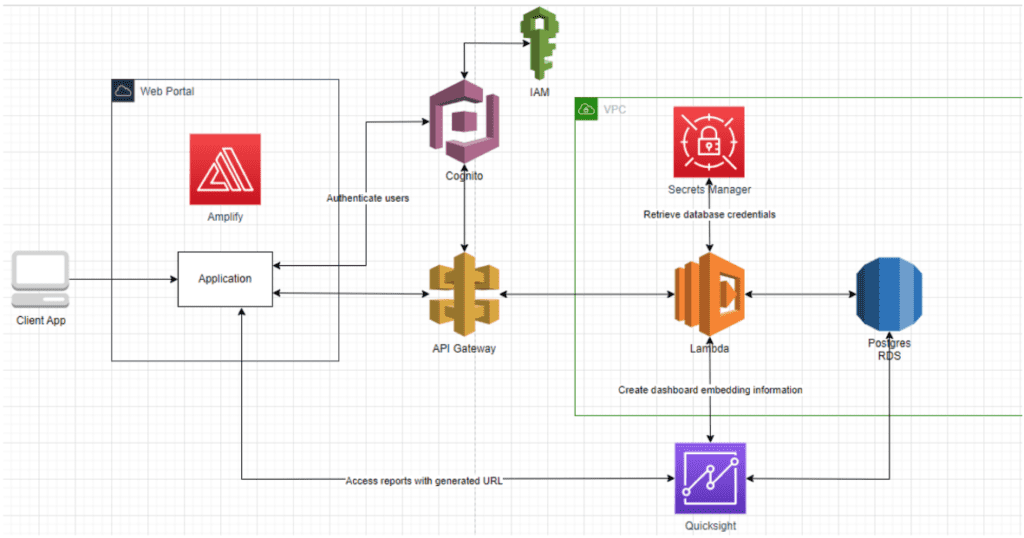
When it comes to top tools for business analytics, Tableau stands out for its robust visualization capabilities. It allows users to create various interactive and shareable dashboards, making it easier for stakeholders to interpret complex data. Microsoft Power BI is another excellent option, integrating seamlessly with other Microsoft products and offering real-time dashboard updates. AWS QuickSight, a scalable, serverless, embeddable, machine learning-powered business intelligence service, is also noteworthy for its versatility and power.
Integrating these tools into business systems significantly enhances visualization capabilities. Executives benefit from real-time insights, enabling them to make informed, data-driven decisions quickly. These tools’ advanced analytics features, such as predictive analytics and machine learning, further drive business intelligence. This combination of real-time data and advanced analytics helps organizations uncover deeper insights, spot trends, and respond proactively to market changes.
Techniques to Maximize the Impact of Data Visualization
Maximizing the impact of data visualization involves selecting the proper techniques to present information clearly and effectively. Effective visualization techniques can transform complex data sets into easily understandable visuals, aiding in better decision-making and communication. By choosing the appropriate method, businesses can ensure that their data is seen, comprehended, and utilized effectively.
Among the most effective visualization techniques are:
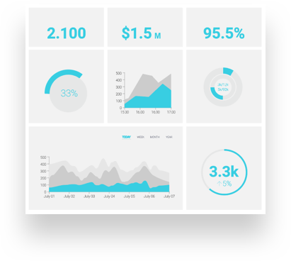
- Dashboards: Centralize key metrics and KPIs for quick, at-a-glance updates. Dashboards provide a comprehensive view of critical data points, allowing executives to monitor real-time performance and make swift decisions.
- Infographics: Combine graphics and data to tell a compelling story. They are beneficial for summarizing complex data in a visually appealing and easily digestible format.
- Interactive Charts: Allow users to engage with the data, customize their views, and explore different aspects of the information.
Selecting the appropriate visualization technique depends on the data type and the intended audience. For instance, dashboards are ideal for real-time monitoring and operational decision-making. Infographics are perfect for presenting summaries of complex data to stakeholders in a visually engaging manner. Interactive charts are beneficial for detailed data analysis, enabling users to dive deeper into specific data sets.
By aligning the visualization method with the audience’s needs and the data’s nature, businesses can enhance the clarity and effectiveness of their data presentations.
Spotting Trends with Advanced Data Analysis Tools
Advanced tools can be essential for identifying trends and patterns not immediately apparent in raw data. These tools offer sophisticated capabilities that enhance the depth and accuracy of data analysis, enabling businesses to gain more nuanced insights.
Key advanced tools include:
- Microsoft Azure Machine Learning: Offers robust machine learning capabilities to identify trends and patterns, allowing businesses to predict future outcomes and make data-driven decisions.
- AWS SageMaker: Simplifies the process of building, training, and deploying machine learning models, making advanced analytics more accessible and efficient for organizations.
Businesses can uncover deeper insights by integrating AI and machine learning with data visualization tools. For example, predictive models can forecast future trends, enabling proactive decision-making. This integration allows companies to go beyond surface-level analysis and understand the underlying factors driving their data, leading to more informed and strategic decisions.
Latest Trends in Data Visualization
Current data visualization trends are revolutionizing how businesses interpret and utilize their data. Augmented analytics, for instance, enhances data analytics with AI and machine learning, making insights more accessible and actionable. This trend is making it easier for non-technical users to harness the power of advanced analytics.
Another significant trend is storytelling with data, which uses narrative techniques to make data more relatable and engaging. This approach helps stakeholders understand the context and significance of the data, leading to more informed decision-making. According to Gartner, “By 2025, data stories will be the most widespread way of consuming analytics, and 75% of stories will be automatically generated using augmented analytics techniques”. By crafting narratives around data, businesses can effectively communicate complex information in a way that is both compelling and easy to grasp.
Looking ahead, future data visualization technologies will likely focus on more advanced AI integrations, offering even more precise and actionable insights. As AI technology continues to evolve, we can expect visualization tools to become even more intuitive, providing real-time, automated insights and predictions. These advancements will further empower businesses to leverage their data for strategic advantage.
12 Ways to Enhance Decision-Making with Data Visualization
From real-time dashboards to predictive analytics, various visualization techniques can help you gain deeper insights, spot trends, and make more informed decisions. The following are 12 essential ways to enhance decision-making with data visualization, highlighting the tools you can use and their benefits.
1. Utilizing Real-Time Dashboards
- Tools: Microsoft Power BI, AWS QuickSight, Tableau
- Benefit: Real-time dashboards enable quick decision-making by integrating real-time data and displaying KPIs and metrics relevant to business operations.
By providing an at-a-glance performance overview, executives can monitor critical data and respond to changes swiftly. According to one study by IDC, businesses that use real-time analytics are five times more likely to make timely decisions. Read about 6 Creative Ways to Use Business Intelligence Dashboards.
2. Implementing Predictive Analytics
- Tools: Microsoft Azure Machine Learning, AWS SageMaker, IBM SPSS Statistics
- Benefit: Predictive analytics uses models to forecast future trends, allowing for proactive rather than reactive strategies.
By anticipating potential outcomes, businesses can make informed decisions that position them ahead of market shifts. This forward-thinking approach mitigates risks and capitalizes on emerging opportunities, ensuring sustained growth and competitive advantage.
3. Geographic Mapping
- Tools: Microsoft Power BI (with ArcGIS), Google Maps API, Tableau
- Benefit: Geographic mapping visualizes geographic data to identify regional performance patterns and market opportunities. This technique helps businesses understand spatial relationships and regional trends, aiding in strategic planning and resource allocation.
By pinpointing areas of high performance and identifying underperforming regions, companies can tailor their strategies to optimize market potential and drive targeted growth.
4. Comparative Analysis
- Tools: Tableau, Microsoft Excel, AWS QuickSight
- Benefit: Comparative analysis employs side-by-side comparisons of data sets to spot trends and anomalies. This method allows businesses to evaluate performance across different periods, business units, or other categories, identifying areas for improvement or investment.
By clearly visualizing differences and similarities, companies can make more informed decisions and adjust strategies to enhance overall performance.
5. Trend Lines in Time Series Data
- Tools: Tableau, Microsoft Power BI, Google Charts
- Benefit: Trend lines in time series data identify growth, declines, and cyclical patterns over specified periods.
By visualizing these trends, businesses can better understand historical performance and predict future outcomes. This insight helps in strategic planning, allowing companies to proactively capitalize on growth opportunities and address potential downturns. According to a study by McKinsey, organizations that effectively use time series analysis can improve forecasting accuracy by up to 20%.
6. Correlation Analysis
- Tools: R (with ggplot2), Python (with Matplotlib), Microsoft Excel
- Benefit: Correlation analysis uses scatter plots to find correlations between variables impacting business outcomes.
By visualizing the relationships between different data points, businesses can identify key factors that influence performance. Understanding these correlations helps make data-driven decisions that optimize strategies and improve overall results. For example, uncovering a solid correlation between marketing spend and sales growth can lead to more effective budget allocations.
7. Hierarchical Tree Structures
- Tools: D3.js, Microsoft Power BI, AWS QuickSight
- Benefit: Hierarchical tree structures break down complex data into digestible and actionable pieces. This visualization technique organizes data in a hierarchical format, making it easier to understand relationships and dependencies within the dataset.
By simplifying complex information, hierarchical tree structures enable businesses to identify key insights and make informed decisions quickly. This method is beneficial for analyzing organizational structures, project plans, or any data set with multiple levels of detail.
8. Using Animated Visualizations
- Tools: Tableau, Microsoft Power BI, Google Data Studio
- Benefit: Animated visualizations show changes over time, making dynamic data easier to understand.
By animating data points, trends, and patterns become more apparent, allowing users to grasp the evolution of data at a glance. This technique is especially useful for presentations and reports, as it engages the audience and enhances the storytelling aspect of the data. Animated visualizations can reveal insights that static charts might miss, providing a clearer picture of how data evolves and impacts business outcomes.
9. Incorporating User-Interaction Features
- Tools: Tableau, QlikView, Microsoft Power BI
- Benefit: User-interaction features allow users to explore data subsets and view relevant information.
By incorporating interactive elements into visualizations, businesses can enable users to drill down into specific data points, customize their views, and uncover insights tailored to their needs. This interactive approach enhances engagement and makes data analysis more accessible, ensuring users can find and focus on the most relevant information for their decision-making processes.
10. Performance Scorecards
- Tools: Microsoft Power BI, Tableau, SAP BusinessObjects
- Benefit: Performance scorecards provide a quick overview of the organization’s health and achievements against goals.
By compiling key performance indicators (KPIs) and metrics into a single, easy-to-read format, scorecards allow executives to monitor progress and identify areas needing attention. This comprehensive view helps ensure that strategic objectives are met and facilitates timely adjustments to improve overall performance.
11. Utilizing Dashboards for Benchmarking
- Tools: Tableau, Microsoft Power BI, AWS QuickSight
- Benefit: Dashboards for benchmarking include industry benchmarks or competitor data to gauge performance.
By comparing your company’s metrics against external standards, you can identify strengths, weaknesses, and areas for improvement. This benchmarking process provides valuable context, helping businesses understand their competitive position and make data-driven decisions to enhance performance and achieve strategic goals.
12. Storytelling with Data
- Tools: Tableau, Microsoft Power BI, Adobe Analytics
- Benefit: Storytelling with data crafts narratives around data, making complex data relatable and persuasive to stakeholders.
By using a series of visualizations to tell a cohesive story, businesses can highlight key insights, trends, and outcomes engagingly. This approach helps communicate the significance of the data, making it easier for stakeholders to understand and act on the information presented. Effective data storytelling can drive better decision-making and foster a deeper connection with the data.
Implementing Data Visualization in Your Organization
The first step is to assess your current data needs by evaluating the existing data landscape and identifying areas for improvement. This assessment helps pinpoint gaps and opportunities in your data strategy. Next, choose the right tools that align with your business needs and goals. Selecting the appropriate data visualization tools ensures that you have the capabilities required to transform raw data into actionable insights. Training your team is also crucial; ensure they are proficient in using these tools to maximize their effectiveness. Continuous learning and skill development will help your team stay updated with the latest features and best practices.
Integrating data visualization into an organization can present several challenges, but these can be effectively managed with the right strategies. One common challenge is resistance to change. Employees may hesitate to adopt new tools and processes, hindering implementation.
To overcome this, it’s important to demonstrate the value of data visualization through pilot projects and success stories that highlight tangible benefits. Another challenge is ensuring data quality. Inaccurate or incomplete data can undermine visualization efforts. At WCI, we help businesses overcome challenges and seamlessly integrate data visualization into a business’s operations, providing comprehensive training and support. This approach ensures that your data visualization efforts are effective, impactful, and aligned with your business objectives.
Transform Your Decision-Making with Data Visualization
Data visualization is a powerful tool that can revolutionize how businesses make decisions. By leveraging the right tools and techniques, executives can uncover insights, spot trends, and drive informed strategies. Effective data visualization enables organizations to translate complex data into actionable intelligence, enhancing operational efficiency and strategic planning.
Ready to take your data visualization to the next level? Get a Free On-Site BI Architect Session with WCI today and unlock the full potential of your data for strategic growth and informed decision-making.


