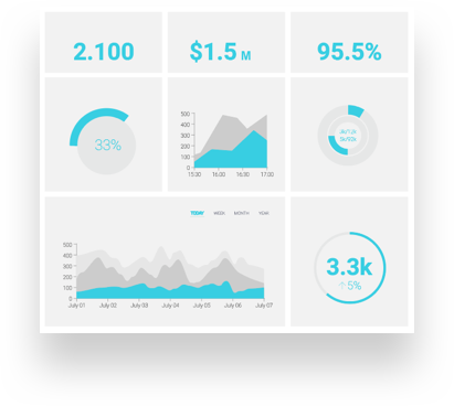
Data is the most powerful tool a business can use to assess how its performance is doing, predict upcoming trends, and benchmark goals for the future. Business intelligence dashboards help companies interpret this often complex data and use it to forward their business.

While dashboards make it easy for a company to visualize its data by displaying metrics, graphs, gauges, maps, percentages, and comparisons of all the information streaming in and out of the company, being creative with how one leverages these numbers can be a challenge. By viewing data in new and innovative ways, companies can better understand where they stand and how to improve certain areas of the business. 

We’re sharing 6 ways you can get started in this department.

1. Monitor metrics and KPIs from different departments

By using BI dashboards to assess metrics and KPIs across your entire business, you can better understand where opportunities for improvement exist. Siloed data can be hard to connect to other departments – but BI helps you see how everything is connected and plays into different areas. 

Better understand the entire lifecycle of products, customer journeys, and more from start to finish with BI dashboards and connect the dots across all departments. Not only does your business better understand its customers and products, but you can cultivate more collaboration within your company in the same breath. 

2. Use interactive filters

Interactive dashboards ensure the analysis experience is as efficient and intuitive as possible for anyone interpreting data. Static dashboards are no longer efficient to use. When building interactive dashboards, always keep interactivity in mind. This can be achieved using various filters that make your data easier to navigate and view. 

Some common interactivity filters that you may want to try include the following:

  • Drill-downs: A drill-down filter allows you to visualize lower levels of hierarchical data all in one chart. The value of drill-downs lies in the fact that you don’t need to overcrowd your dashboards to get a more detailed view; you can do everything in one single chart.
  • Drill-through: Similar to a drill-down, a drill-through filter allows you to visualize additional, more detailed views about a specific KPI. The difference is that a drill-through will show you the additional data in a pop-up instead of the same chart.
  • Click-to-filter: Another useful filter to enhance interactivity is the click-to-filter. As its name suggests, to use this filter, all you need to do is click on a specific graph, and the entire dashboard will be filtered based on it. Applying it lets you explore your data and instantly extract deeper understandings.

The Linking feature allows you to use elements within a report (a table or chart) to act as input controls for a selection performed in another component (a table, chart, or the entire report). In addition, you can specify whether one or all of the element dimensions will be used as selectors.

3. Explore demographics and trends

Demographics and trends can be critical in simplifying complex data using charts, maps, infographics, and graphs. These visual data representations of things you may not immediately notice are that strictly numbers and text reports can be highly revealing. As a result, it becomes easier to detect trends, patterns, and data relations essential for decision-making. Leverage this real-time data to unveil actionable insights and visually represent trends that can change how your company is doing things for the better. 

4. Use storytelling 

While storytelling is a powerful best practice any business can use, regardless of industry or sector, it is particularly helpful when interpreting data. A compelling narrative will capture your audience’s attention and break down your findings in an inspirational and digestible way. In addition, storytelling with BI can show you new information about your customers and community you didn’t already know. 

This approach will result in increased success across the board. Not only can you see trends and patterns within your data, but storytelling using a larger narrative can paint the big picture, which may help you visualize larger metrics, set long-term goals, and more.

5. Make data part of your everyday workflow 

Creating a culture of using data and making decisions solely based on it will strongly encourage employees to use advanced BI solutions daily. Spreading data culture will help workers be aware of – and understand – BI products and their features. And they are then more likely to use these products effectively every day. 

A company can also appoint a specific team to play the role of early adopters who can later share their knowledge and experiences with their peers on forums and in training. Announcing a successful BI project may also kindle other teams’ enthusiasm for new data solutions. Setting up a website for communication purposes can inform the rest of the staff and be part of a training program to help get them started with their BI-powered projects.

6. See a different perspective and discover new insights

Business intelligence dashboards come in different forms and cover various topics based on your industry. With an increasing number of chart types and more and more data being visualized, the possibilities of how the data can be displayed and the stories they can tell us are virtually endless. Finding a system that works for your needs and abilities is key.

Start getting creative with your data 

At WCI, our business intelligence consulting helps companies organize, optimize, and analyze their business data to make more informed and profitable data-driven decisions. If you’re ready to tie together business data from your entire company to inform you better and discover opportunities, we’re here to help.  


Get started today with our experts.

In today’s increasingly data-driven world, it’s more important than ever to have accessible ways to view and understand data and leverage it to make informed business decisions. Business analytics and data visualization provide insights into how things have historically played out, possibilities for new scenarios, and much more. 

It’s no surprise businesses today have gravitated toward wanting to understand and leverage data visualization capabilities as an efficient way to help make sense of business-critical information and large sets of complex data at scale. Across all industries, business leaders today understand the importance of data and how to use it to its fullest potential – with the help of analytic dashboards and data visualization tools

In this post, we’re breaking down analytics dashboards, data visualization, what each is, their advantages, and how they can impact your business in significant ways. Let’s dive in!

Why is data visualization important?

Business intelligence aims to collect and turn data into actionable information that fulfills operational and strategic objectives and supports a person’s decision-making. Why is it important? Because it helps people see, interact with, and better understand their organization’s data. Whether simple or complex, effective visualization and BI tools can bring everyone together on the same page, regardless of their expertise with data or daily interaction with these numbers. 

Not only is the actual data necessary, but the ways BI display them are just as crucial. According to MIT, 90% of information transmitted to the brain is visual. This means that the better we can represent complex numbers like big data, the easier it becomes for all stakeholders and employees to understand. Data visualization ultimately helps provide more people who use BI tools and analytics solutions with a familiar, engaging, interactive way to absorb information at a glance and understand the insights hidden beneath the numbers.

These data visualization tools and processes provide a quick and effective way to communicate and share information in an easy-to-read manner using visual information. 

What is a data visualization dashboard?
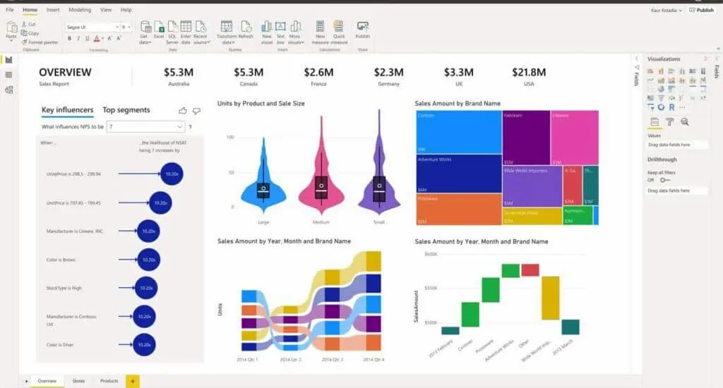
What Is A Data Visualization Dashboard | Power Bi Dashboard Example
Power BI Dashboard Example

Data visualization, also known as data exploration or Business Intelligence (BI), is often referred to as dashboarding. The data visualization industry has garnered much attention over recent years because of the easy-to-understand format in which complex data is delivered. Dashboards, in turn, present this complex data in an easy-to-interpret format. 

These dashboards allow those viewing them to easily track, analyze, and display KPIs, metrics, and critical data points. A good dashboard helps both technical and non-technical users understand and interpret business intelligence to make more informed business decisions. They can actively participate in the analytics process by compiling data, visualizing trends or occurrences, and uncovering an objective view of performance metrics that can be immediately understood.

As BI has become a priority in the past decade, analytics solutions increasingly support newer options to visualize complex data sets and realize effective data visualization. Today, there are many types of data visualization to show and represent data in a more engaging way, with the exact output dependent on the analytics solution in question. 

  • Make data easier to understand for all
  • Increase accessibility and collaboration on data points
  • Create quick overviews of complex numbers

The benefits of using dashboards

For many organizations, multiple tools are used to track KPIs and metrics, such as marketing platforms, email platforms, and CRM tools. Monitoring and analyzing the data from each tool individually takes a lot of time and effort to compile. It’s often disjointed and hard to put together, too. 

The solution? A data visualization dashboard with a graphical representation of your data. 

Dashboards are used for data visualization so that users can glimpse a bird’s eye view of the data from each of their business platforms in one centralized location, gaining the ability to understand what it means for the business quickly. Businesses can also drill down deeper into any aspect of the data with a few clicks. This is great for specific departments to compare year-over KPIs, projections, and more. 

Who is Analytics Dashboards and Data Visualization for?

Analytics dashboards and data visualization can be helpful in many different industries and uses. Many in these fields utilize data visualization for business operations and data-driven decision-making: 

  • Financial services 
  • Healthcare
  • Life sciences
  • Manufacturing 
  • Media and communications
  • Public and social impact 
  • Retail and consumer goods
  • Technology 
  • Transportation 
  • Education
  • And more

Whether it’s a sales department manager in a media company wanting to make their quarterly KPI report more engaging for executives or a C-suite in finance using visualizations to represent their total investments, data visualization is equally essential.

How Do I Get Started With Data Visualization Consulting?

Getting started is fast and easy with the experts at WCI. 

  1. Start with a Free On-site Discovery Session — During the discovery session, you will meet with a senior data analytics consultant from WCI and share your data challenges and goals with us.
  2. Next, we Review the Proposed Solutions — After the session, we’ll summarize, evaluate, and provide a list of data management solutions and a project outline custom to you.
  3. After that, we start the Solution Development Process — After the agreement is signed, WCI and your team work together to develop the right solution that meets your project goals and supports your business. 
  4. Lastly, we move into Training and Support — This is a key stage of our solution and crucial to your data. 

Is your business leveraging data to its fullest potential?

Find out by spending half a day with someone who knows data and can help you answer this question. 

At WCI, our data visualization consultants help businesses organize, optimize, and analyze their business data in ways that help them make informed and profitable data-driven decisions. We help you tie together business data from your entire company to better inform and discover opportunities. 

A Century-Old Investment Management Firm

The Client

A household-name company over 100 years old. An independent global investment management firm and mutual fund manager.

The Challenge

Initially, the company came to WCI to develop a corporate dashboard suite. The purpose was to track and get more visibility on:

  • Investor deferral rates
  • Participation rates (to grade how successful a retirement plan is)
  • Participation count (to trend population changes)
  • Average rates of return
  • Distributions
  • Auto-enrollment participation
  • Auto-increase participation

Our successful dashboard solution earned WCI a slot in the client’s international Preferred Vendor Bid against nine other companies. We were subsequently awarded the business and the opportunity to tackle a bigger problem.

Our client’s IT organization was not always able to keep up with the demands of the business. Many departments began hiring outside consultants on an individual basis. These disconnected systems lacked a cohesive support mechanism. As a result, the company had little control over content, quality and maintainability.

A new challenge was issued, with an entirely new list of goals:

  • A simplified vendor set
  • To assure a higher degree of consistency and quality
  • More timely delivery of projects
  • Happier and more well-informed departments among their 12 business owners

The client wanted not an order taker, but an advisor to assist in evaluating new technologies and products that compliment the BI and corporate strategy.

What WCI Did

First, our successful rollout of corporate dashboards equipped them with a clear view of key performance indicators, as reflected inconsistent data

Next, we worked with the client to develop an effective way of delivering projects that fulfill each department’s needs on time.

Scope of Solution

For this client, we deploy consultants on as many as 6 projects at any given time.

Technologies in use include ETL and integration tools, Oracle, SQL Server 2000 and 2005, and Citrix. Also utilized are Dashboard, Business Intelligence and reporting technologies.

The Results

WCI provided this client with a cost-effective solution to its diverse and numerous Business Intelligence project needs and have become their primary advisor on BI strategy and product evaluation.

We have also helped them fill gaps in their ability to support their many business groups and respective departments.

Client Relationship Managers are now able to view actionable demographics within their new executive dashboard. For instance, they can analyze trends over several years for participation rates by age groups, company tenures, asset sizes and more. This information makes possible investment plans that are better suited to their customers.

WCI has also engineered specific processes for new projects, upgrades/migrations, and enhancement requests. In general, each has its own initiation, evaluation, post evaluation, and refinement phases, as well as the associated documentation and review work sessions.

WCI has even instituted a communication model between their client’s resources and WCI’s own customer relationship management and project manager staffs, to be used depending on whether a given request is service or project level work.

See what more WCI clients have to say about our services.